

Hells Warrrior
-
Posts
4,117 -
Joined
-
Last visited
-
Days Won
81
Content Type
Profiles
News & Announcements
Zombies Library
Easter Egg Guides
Intel
Forums
Posts posted by Hells Warrrior
-
-
Sorry, it's all fixed now.
-
You sent it as a report @PINNAZ
")
-
It's still a little slow on mobile, and unfortunately it prioritizes weird things, usually leaving white boxes in some places for a few seconds, (still persists in 'reloading' the background when scrolling, but only seems to be the background now.)
It has gotten a significant bit better, and I'm sure time will keep in improving, but the whole design just seems wrong for mobile.
It's too busy, too many floating boxes over a semi-static background.
Like right now in this thread, the actual thread takes up all of my screen (which is good) except for about an 1/8 or so of my screen on the left side. There it's just a background, it looks weird having the 'site' not take up the whole screen.
Other than that, though, much better than it was a few days ago at least.
Mega, I hear you, I'm working hard to resolve bud and I hope to have all remaining issues resolved ASAP (hopefully tomorrow).
-
The overall speed of the site should now be a lot better, some compression and optimisation has been done.
-
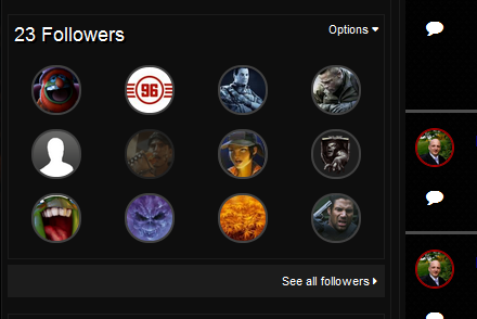
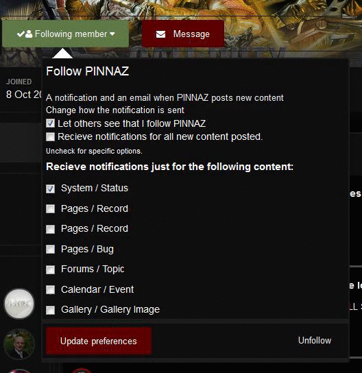
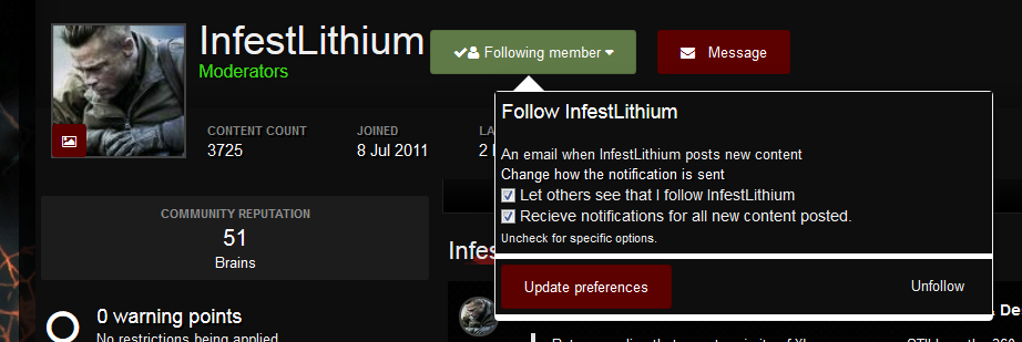
If you had someone as a friend on the previous version of the forum, the system was changed to what is known as followers. The default options for preferences, is basically follow them, you get notifications and emails, you can choose, either or none but you can't chose what you want to be notified about.
Well that has now changed, so if you wish to update your preferences for the people you are following, you can.
On your profile page, you'll see a list of the people you are following
Simply click the members name (for each one) and then you can make the relevant changes to what notifications you receive.
As a result you should stop receiving notifications for everything and you can now customise it to suit what you want to hear about from that member.
-
I've disabled responsiveness for the mobile design until a debug on it has taken place - if accessing from a mobile, you'll get the full site rather than a responsive version.
-
I agree mobile has been overlooked in styling and is being fixed as we speak, I'll release an update to it tonight and I'll also offer the option of a non responsive theme as well. I have a few things going on at the moment and it is high on the list.
-
Not relevant to the site, which is what the suggestions section is for. This is a suggestion for the actual game by Treyarch, so i have moved this to general zombies discussion.
-
Bug as been raised.
-
OK that's a bug, not sure how relevant it is but it's a bug non the less, I'll look into it and see what I can come up with to resolve.
-
All paragraphs have been spaced using enter/return
Paragraph 2 - Paragraph 2 - Paragraph 2 - Paragraph 2 - Paragraph 2 - Paragraph 2 - Paragraph 2 - Paragraph 2 - Paragraph 2 - Paragraph 2 - Paragraph 2 - Paragraph 2 - Paragraph 2 - Paragraph 2 - Paragraph 2 - Paragraph 2 - Paragraph 2 - Paragraph 2 - Paragraph 2 - Paragraph 2 - Paragraph 2 - Paragraph 2 - Paragraph 2 - Paragraph 2 - Paragraph 2 - Paragraph 2 - Paragraph 2 - Paragraph 2 - Paragraph 2 - Paragraph 2 -
Paragraph 3 - Paragraph 3 - Paragraph 3 - Paragraph 3 - Paragraph 3 - Paragraph 3 - Paragraph 3 - Paragraph 3 - Paragraph 3 - Paragraph 3 - Paragraph 3 - Paragraph 3 - Paragraph 3 - Paragraph 3 - Paragraph 3 - Paragraph 3 - Paragraph 3 - Paragraph 3 - Paragraph 3 - Paragraph 3 - Paragraph 3 - Paragraph 3 - Paragraph 3 - Paragraph 3 - Paragraph 3 - Paragraph 3 - Paragraph 3 - Paragraph 3 - Paragraph 3 - Paragraph 3 - Paragraph 3 - Paragraph 3 - Paragraph 3 - Paragraph 3 -
Paragraph 1 - Paragraph 1 - Paragraph 1 - Paragraph 1 - Paragraph 1 - Paragraph 1 - Paragraph 1 - Paragraph 1 - Paragraph 1 - Paragraph 1 - Paragraph 1 - Paragraph 1 - Paragraph 1 - Paragraph 1 - Paragraph 1 - Paragraph 1 - Paragraph 1 - Paragraph 1 - Paragraph 1 - Paragraph 1 - Paragraph 1 - Paragraph 1 - Paragraph 1 - Paragraph 1 - Paragraph 1 - Paragraph 1 - Paragraph 1 - Paragraph 1 - Paragraph 1 - Paragraph 1 - Paragraph 1 - Paragraph 1 - Paragraph 1 - Paragraph 1 - Paragraph 1 - Paragraph 1 - Paragraph 1 - Paragraph 1 - Paragraph 1 - Paragraph 1 - Paragraph 1 - Paragraph 1 - Paragraph 1 - Paragraph 1 - Paragraph 1 -
-
@PINNAZ can you send me this via PM with screenshots and maybe videos as well please? Just so I can get a better understanding of what you are referring too. The paste from word option should past is, you should see exactly what it is that you posted.
I've added 2 new icons to the editor, paste and paste as plain text (only on the full screen version). Send me the links to the posts you are trying to paste too so I can try and recreate the issue you experienced.
I'll have a look at the spoiler but a lot of the posts are still being rebuilt in the background and until these have been rebuilt, quotes, images, spoilers etc will still be incorrect. Although spoilers with text added such as
This is a line of text
was a plugin and not default, so these will need to be amended and updated accordingingly. I'll check into the resize issue with pasting directly into the topic with the soundcloud and videos.
-
OH YEAH AND ONE MORE THING!!
Mobile is FUBAR.
It's not fubared but it has some styling issues I'm aware off and I'm making the changes to these later today. You'll notice the mobile improvements for styling very soon.
-
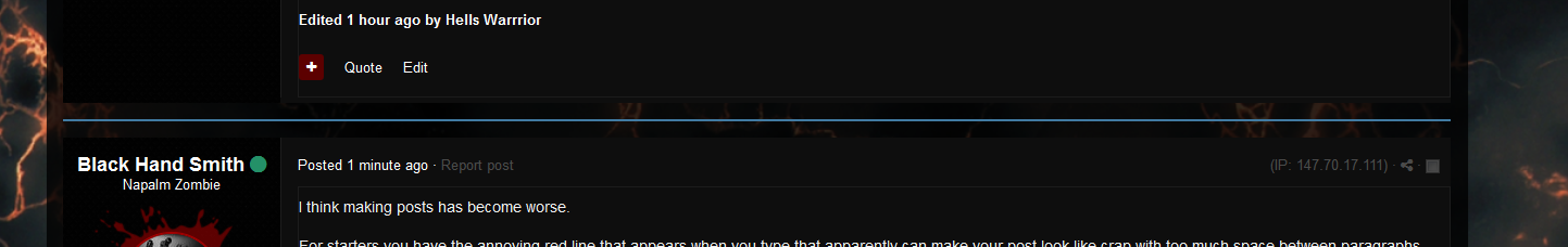
I think making posts has become worse.
For starters you have the annoying red line that appears when you type that apparently can make your post look like crap with too much space between paragraphs. Totally butchered one of my posts.
Also the text it too stretched out so Paragraphs that used to be bigger now look smaller so One paragraph kind of looks like 3 sentences.
The site has a Brand new look which for the msot part looks pretty Cool.
However it also suffers from a few things
Instinct tells you to skip posts that have been darkened out because darkened out posts mean you already read the latest reply. However now everything is dark. And although there is an indication on the left that tells you if you have read it or not it is still harder to notice especially when a post belongs to you and instead of a circle you have a star. That staris also used for featured topics which is confusing.
User Profiles aren't as good as they were before. Before everything used to be in one place. Your Status Feed was on the top of the screen. Your about me was directly below it
Now for the things I Like...
We have gifs in the Chat now. Which I think is a Nice feature.
And other than that either everything is the same, Worse than before, or Gifs....Just Gifs..
The Site is still easy to maneuver around the topic sections so you can still find a specific post from before. Tags are now Highlighted I Kind of Like that.
So in conclusion I think the New site Looks nice but is less appealing when it comes to functions and displays. Also....we have gifs...
I think making posts has become far easier, I think it's just a learning curve on using the new editor and getting used to it.
The red line you refer to, is basically there to create a new paragraph - you can ignore it or you can click it to start a new paragraph, hitting enter/return does the the same thing. Regarding stretched out text, could you link me to a topic which has this particular issue? I think it might be due to the post rebuild which is still occurring in the background. I also think you'll be used to double tapping enter/return - you don't need to double tap enter or return just the single press is enough (from reading/viewing a couple of posts this appears to be what's happening).
Regarding entering a topic and know what was the last post you read within the topic, anything below the blue line is unread.
I might make some changes to the colour of that line to make it more prominent
This star basically is saying this is a post you have contributed too. When it's dull no new replies exist, When you have unread replies it is brighter (just like the dot in the image shown below)
Tells you, that if you click it, you will go to the first unread reply.
When nothing exists as shown above, you have read everything but haven't contributed anything to the topics.
Regarding the profile page, everything is still accessible from the top of the profile page but it defaults to activity feed, what have you been participating in to make it easier to find and navigate to your content. You can simply click status feed, about me and be take directly to that information. Yes it's not all on the one page however, it is more user friendly imo.
I'm glad you like some of the improvements and we hope to make some more in time - thanks for taken the time to feedback and hopefully my explanations of a few things have helped.
-
Welcome aboard folk's glad to have you with us.
-
I have attached a poll with a few questions relating to the new look of the site, it hasn't been fully completed yet but the main part the forum has been put live.
We know we have had a small number of issues since going live on Friday and we have resolved these and experienced time offline as a result, which we can only apologise for. However, we wanted to get an understanding of what you think on how it looks, how it responds, how the speed of the site is, how easy it is to use etc.
If you need to ask question then please do so but please also vote so we can get a better understanding.
For instance, regarding posting. Did you know, that if you want to insert a tweet, picture, video, snapchat etc - you can simply paste the link into the post and it will automatically appear?
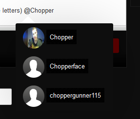
Did you know, that if you want to mention someone to draw their attention to a post/topic you can simply starting typing (lowercase letters) @Chopper then a menu appears with a list of usernames, click the username you need to mention someone
Did you know that how you format the post in the editor, is how it should and will appear once you press submit?
Did you know you could create tags for the topic, when other tags are created using the same or similar tags, it will create a list of topics/posts with similar tags?
Did you know that we have new smileys and emojis are being added
Did you know that emoji's are supported as standard ? ☎️
Did you know that you can ignore a specific members signature, or you can ignore all signatures?
-
Please post in this topic until the issue with posts not displaying is resolved.
-
-
We are aware of a couple of issues with the new update, we are working on this as quickly as possible. Some of these are issues which we can fix directly and you'll have noticed some of the style issue and width issues have been fixed. However, some are system issues which have tickets raised for.
We hope to have these resolved as quickly as possible and we apologise for the inconvienence.
If you notice anything, please report it to the bug tracker so we can have it investigated and fixed.
-
Yes, these are very intense topics/posts due to the amount of content that is in them. We are aware of this, it is the same issue on the previous version of the forum. It is becoming part of the site and reduced and condensed. It is being worked on but the remaining parts of the sites such as pages, news and so forth will be coming sooN - I just need to iron out a few bugs first that are present at the moment.
-
-
The site itself (previous forum) was basically put together to get the forum migrated from PHPBB to Invision but to try and keep the look and style as much as possible. The plan has always been for the past 16/18 months to brings this to you but this new software did not officially get released until recently.
The design has been in place since December, with a few minor amendments and adjustments need to be done once live.
It's apparent we are running slower that anticipated and some topics are taken an age to load, this was not happening in the beta testing stages of this site or in fact the main invision forum site. Lots of background processes are still taken place, memcached has been enabled and content is being cached for guests to reduce requests for the same page (cached for 180 seconds).
Once all the background processes are out of the way, we will then check the performance and then raise any tickets we feel are needing to be raised regarding speed (it's no different on the default theme).
If we need to consider more RAM, more CPU and SSD to increase read and write speeds, then it is an option we will need to investigate. We are at the moment, pretty optimised with regards regarding the server but we could do with upgrading php/mysql again as we aren't on the most current version but we are on a stable and quick version. We may consider a different database system such as MariaDB / PostgreSQL but performance testing would need to be carried out to see which is better of them all for us (MariaDB is pretty much the preferred choice these days).
But yeah, it was due an overhaul and it needed modernising and I'm glad that we have a responsive site design.
-
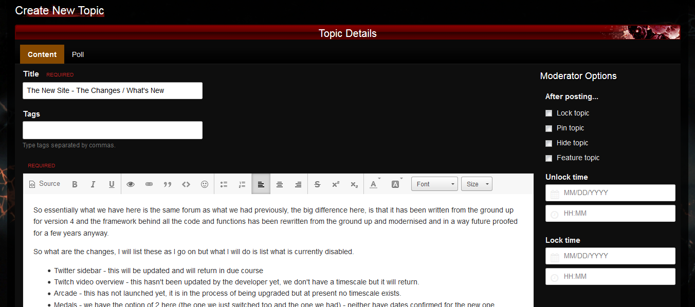
So essentially what we have here is the same forum as what we had previously, the big difference here, is that it has been written from the ground up for version 4 and the framework behind all the code and functions has been rewritten from the ground up and modernised and in a way future proofed for a few years anyway.
So what are the changes, I will list these as I go on but what I will do is list what is currently disabled.
- Twitter sidebar - this will be updated and will return in due course
- Twitch video overview - this hasn't been updated by the developer yet, we don't have a timescale but it will return.
- Arcade - this has not launched yet, it is in the process of being upgraded but at present no timescale exists.
- Medals - we have the option of 2 here (the one we just switched too and the one we had) - neither have dates confirmed for the new one we just added on the previous version is the one that is currently being updated. We haven't lost any medals, they will return as before.
- Youtube video sidebar - we'll add this back in, it was a plugin we used but we hope to offer something better and we are currently looking into this.
- Frontpage - this has gone in it's previous guise, it will be returning but central to the entire community. The forum is currently the frontpage of the site (always has been for sometime) this willbe changing once we have things ready (shouldn't be too long).
- Code of Conduct - Not currently visible, we'll add this asap but working on fixing a few kinks first before we add additional things back in.
So What are the major changes?
Responsive design, basically meaning that from any device everyone should have the same experience. The site adapts to the screen size. for example
Now we appreciate that not everyone likes mobile designs and they think full site access is better, we appreciate that so the choice belongs to you, you can use the full site version by selecting from the theme dropdown menu at the foot of the site and selecting "Mobile Non Responsive" - this will change the default when using mobile and will also be the same when you access the site from a desktop/laptop.
- Followers
This used to be friends, friends basically showed you had a list of friends but didn't really do anything. Now you have followers. Please note, that as part of the upgrade, friends got converted to followers, now what will happen is when a follower posts a message or has any activity on the site you may receive a notification in one of several ways. Yes you will get spammed.
To take contol of this, you can do the following go to the members profile and then
We'll add more options to this in due course but if you want to stop messages, untick "receive notifications for all new content posted"
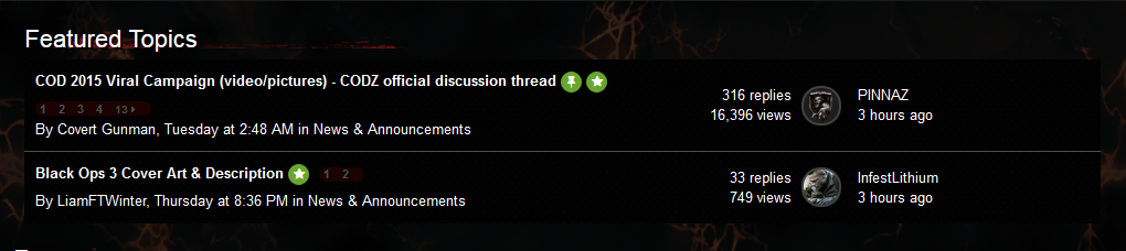
- Featured Topics
These have now changed significantly, easier for a staff member to feature a topic and we can feature 5 in total (that's what is currently set), the likely scenario is we will have 1 topic listed as featured and then across the top of the forum a new featured content system that shows as many feature content topics that we wish to set.
One of the other big changes is the editor itself, you'll notice that a lot of the familar tabs are gone, this is because they aren't really needed anymore. What you see when you type is what you get (wysiwyg editor) - the huge difference with this is 2 fold in my view.
- Want to include an image? Just paste the link (needs to end in png, jpg, gif etc).
- Want to insert soundlcoud? Just paste the ink
- Want to include vimeo? Just paste the link
- Want to include youtube? Just paste the link
- Want to include twitter? Just paste the link (see)
I'm sure you get the jist of it.
- Auto scroll back to the top
This will appear on the right side of the screen whenever you are not at the top of the page
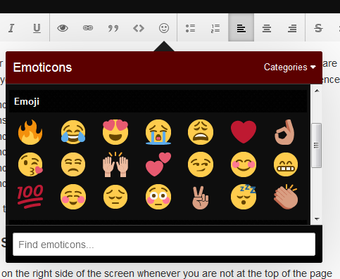
- Emoticons
We are adding loads of new emoticons and we are also supporting emoji's as standard and are vectored (images so to speak).
The old faithful emoticons still exist but we'll add more to this as well
We'll be adding some new ones as well such as look emotions
We have lots of new features yet to be added, some cool new integration options such as zombiefication and prestige being linked, the brains system is now part of the like system - so if you like something don't fret about whether it's good enough, we have something in store for great content.
This is just some of the things that have changed, I'm sure I have missed a lot but it gives a general overview just now.
-
")


Zombie Choral Canon - Music by Kevin Sherwood
in General Zombies Discussion
Posted
test
https://www.facebook.com/djricharddurand/videos/10153038406374662/